Google Messages
Media Sharing Program
How I led a redesign that gave Google Messages a premium, expressive edge at a pivotal moment in messaging history
As UX lead across two major media workstreams in Messages, I directed the end-to-end strategy for a more expressive, accessible, and polished photo/video experience. I facilitated a 30+ person vision workshop, defined phased execution milestones, and collaborated closely with engineering, PM, and motion to deliver a cohesive user journey.
ROLE
Area Lead
UX Designer
Art Director
Mentor
TEAM
3 Product Managers
User Researcher
Eng Team
UX Designer
Motion Designer
PRESS
Coming soon
Please note: Due to a Non-Disclosure Agreement (NDA), I can't disclose specific details, design processes, or metrics of certain projects. Reach out to me for more details hello@alexschor.com
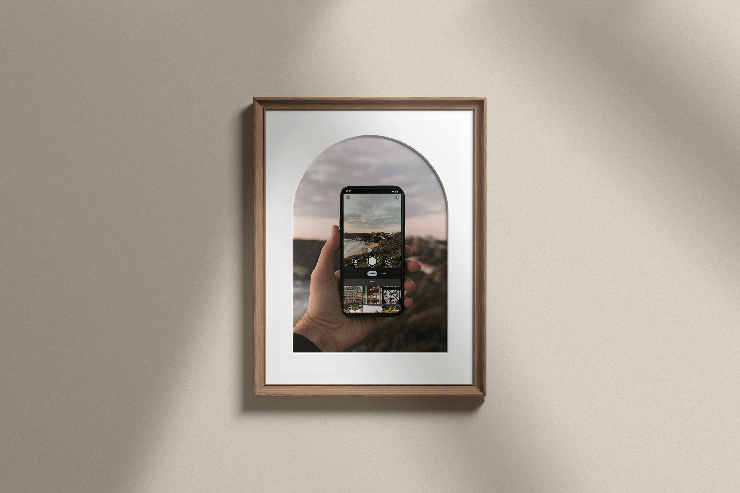
“Why is your video so blurry?”
“Green bubbles” have long been associated with low-quality, clunky experiences. Media sharing in Google Messages was no exception — basic, slow, and disjointed, especially compared to social and third-party apps.
It’s not easy being green
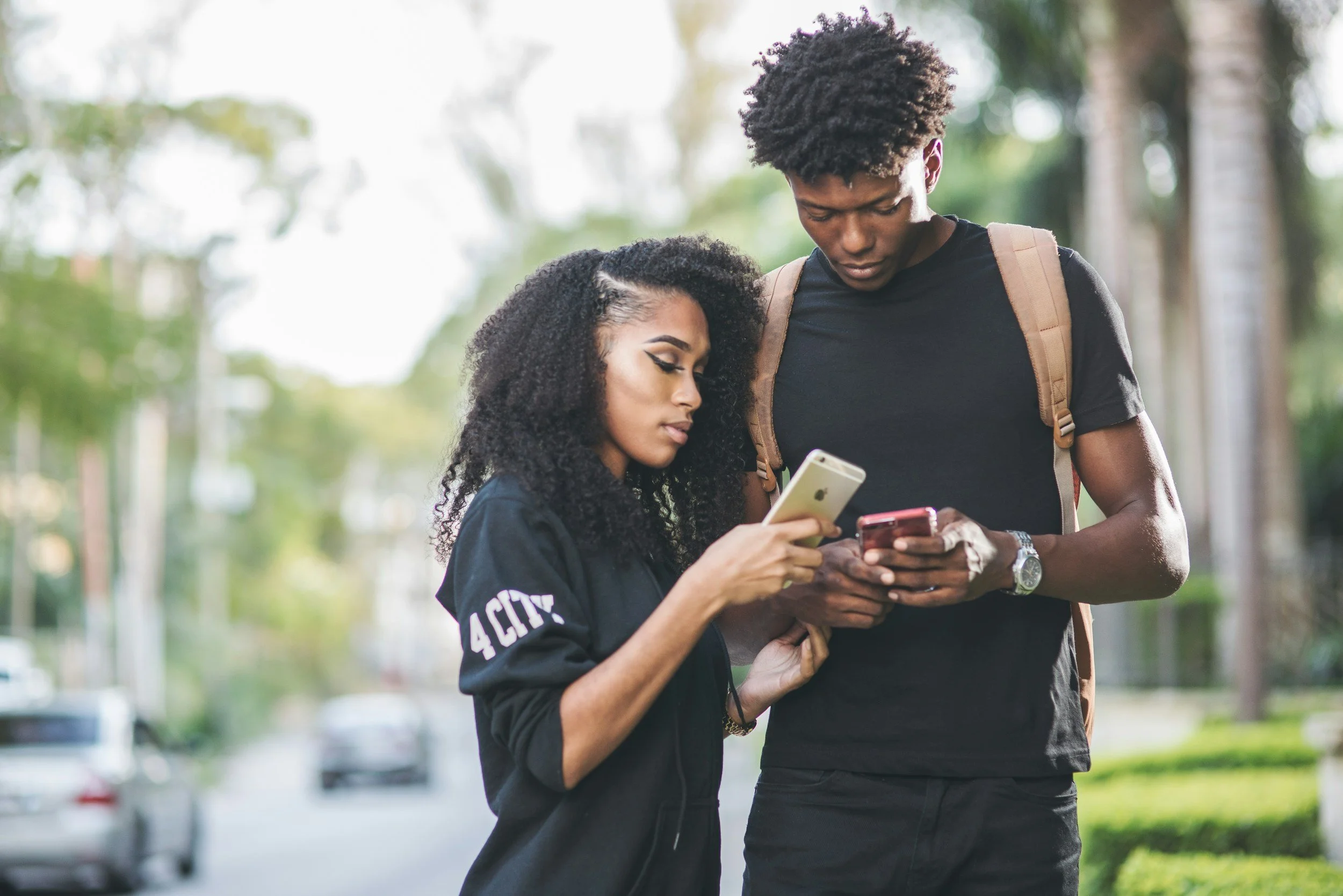
“Uh yeah, looks great 😬”
“Let’s move over to WhatsApp”
Business Opportunity
After years of pressure from regulators, our own press campaigns, and persistent partnership work, Apple finally agreed to support RCS.
This breakthrough not only improves cross-platform media sharing, it rebalances the narrative. It opens the door for better user experiences and a more level playing field.
For years, Android users were stuck with blurry videos, broken group chats, and security gaps—not because we lacked the technology, but because Apple refused to adopt it.
With momentum finally shifting, I convinced the team to invest in a complete redesign of our media sharing flow. This was our moment to modernize the experience, reset expectations, and show users what messaging should feel like.
Foundational Research
I partnered closely with our researcher to revisit years of foundational insights on media sharing.
We dug through past studies, user pain points, and behavioral data to uncover what still held true—and where expectations had evolved. Instead of starting from scratch, we used this deep well of knowledge to move faster and smarter, grounding our redesign in real user needs from day one.
DISCOVERY
The capture & send journey on Messages was simple and limited, while users today expect more.
Photos sent 1 by 1 quickly fill up the conversation screen, which makes users scroll


Research Insight
Some users believed that Google Messages does not “create opportunities to strengthen and deepen their relationships” because the app does not facilitate seamless use of different media formats.
Research Participant
“Being able to take a picture, edit it, and send it directly to whoever you need to without having to use multiple apps will be a game changer in my opinion.”

How might we create…

Workshop
Bringing everyone to the table
I led a 30+ person, weeklong cross-functional workshop to align on pain points and imagine the future of media sharing. Using creative prompts and empathy exercises, we surfaced core user needs, shared frustrations, and bold possibilities.
The result: a shared vision that energized the team and shaped the design direction.
Creating a vision
After the workshop, I led the design team in translating our direction into a high-fidelity concept. We turned early ideas into a polished, inspiring vision that brought the strategy to life.
De-risking through research
To build confidence in the direction, we ran two rounds of user research.
Value testing compared the new flow to the existing one. Users completed tasks faster, noticed larger imagery, and preferred the cleaner, more modern layout. The updated design clearly provided more value.
Usability testing explored how easily people could send multiple photos, add captions, and navigate new entry points. Most tapped through the flow with ease, as if they had used it before.
We also included participants who rely on assistive technologies to ensure the experience was accessible to all.
The results gave us confidence to move forward with a design that felt both familiar and inclusive.

Shaping the vision across teams
One of the biggest challenges was how ownership was split. The media sharing flow touched two core product teams and at least two adjacent ones, each responsible for a different piece of the experience. It was disjointed by default, and without alignment, that fragmentation would be felt by users.
In a PM-first culture, it wasn’t easy to be seen as a strategic lead from design, but I felt strongly that this moment called for more than a collection of disconnected features. I surfaced the problem early and framed it as both a user risk and a strategic opportunity. Rather than dividing ownership, I pitched a shared vision we could all rally around. It took multiple rounds of pitching and facilitated collaboration to get buy-in, but we aligned around the need for a cohesive system.
Roadmap Milestones
Building Alignment
With alignment in place, I partnered with PM and engineering leads to land the work on the roadmap. I translated the vision into a coordinated system of over 10 interdependent features, each phased intentionally to match team bandwidth while protecting the integrity of the experience.
I mapped out milestones, clarified ownership across teams, and created a structure that helped us move quickly while staying connected. Throughout, I kept the team focused on the bigger picture. This wasn’t just a UX update. It was a chance to reframe Android’s messaging experience at a critical moment. Prioritizing this meant tradeoffs, but I made the case that we couldn’t afford to fall short. That persistence helped us move forward as one team with a shared direction.

Effects - Samsung requirement with tight deadline

Design
With the vision in place, it was time to dive into the details. I mentored UX designer Iris Chung as she led the conversation view experience, including the media gallery and commenting flow. I provided strategic guidance while overseeing the full media workflow, and Iris brought a strong visual design lens that elevated the overall polish and clarity of the experience.
UX PRINCIPLES

Design Challenges
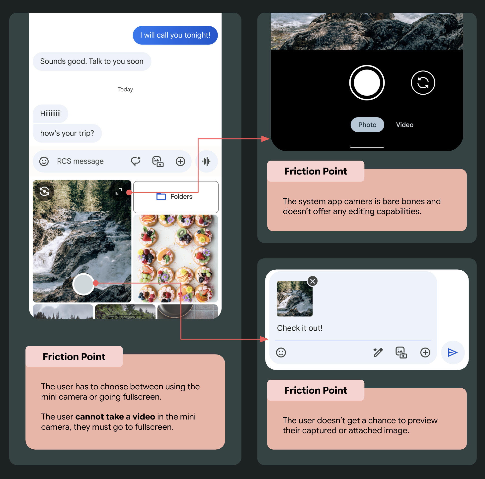
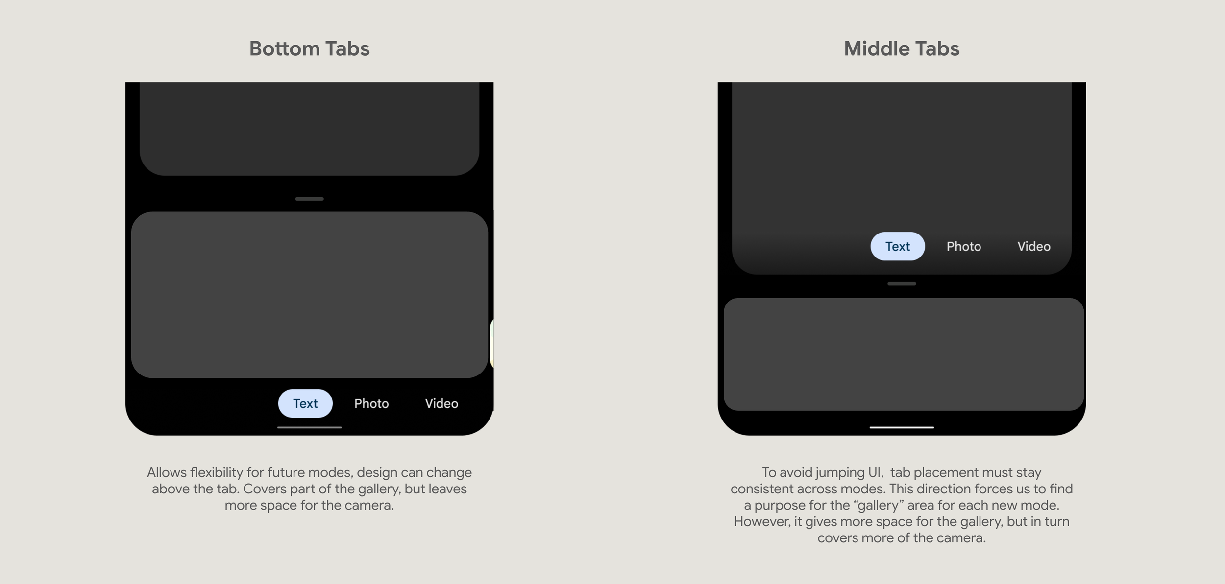
Camera Ratio Debate:
PM pushed for a larger camera ratio to prioritize capture. I advocated for a gallery-forward approach, citing data science showing that most users select existing photos. A larger camera view would reduce gallery visibility—especially on small devices. I supported my case with user research and accessibility considerations, and successfully influenced the decision.
Gallery Layout Tension:
PM wanted 4 smaller thumbnails to encourage quick sends. I pushed for 3 larger images based on research: users often take several near-identical photos (especially of pets, kids, food) and need visual clarity to choose the best one. We aligned on launching with 3, with future experimentation in mind.
Combining Camera + Gallery:
We opted to merge these entry points into a single media tray—streamlining access and reinforcing a unified mental model. This also fulfilled Samsung requirements to surface Camera Effects natively within the view.
Cloud Gallery Integration:
I led design collaboration with the Android Photo Picker team to embed Google Photos search and cloud content into the native gallery. This work helped influence broader system-level decisions around photo selection, and required tight coordination to ensure visual and interaction consistency.
Advocating for Craft & Motion:
I championed a high degree of visual polish, animation, and thoughtful transitions—treating this flow as a flagship user experience. While craft was not initially prioritized, our talented motion designer made the case through multiple stakeholder pitches, showing how elevating the motion system could create delight and signal Android’s design evolution. This effort contributed to a larger, ongoing conversation about visual quality across the platform.

An immersive upgrade
*
An immersive upgrade *
Key Design Decisions & Iterations
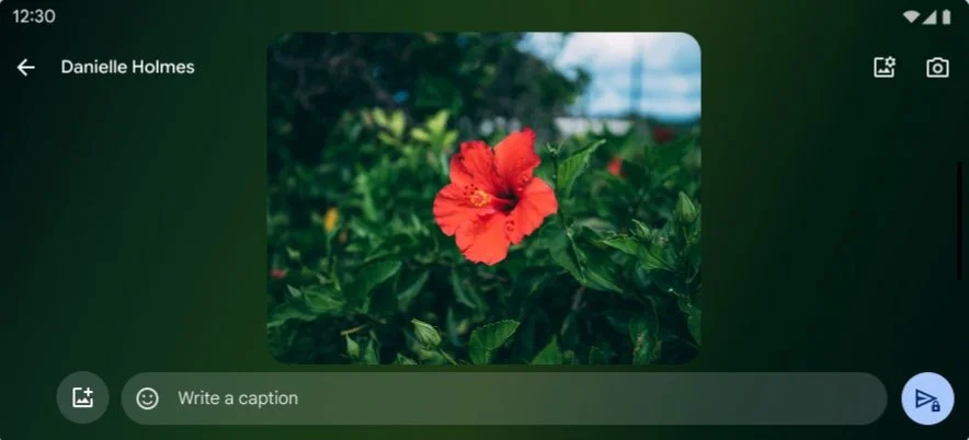
Enhanced Media View: We replaced the small gallery preview with an immersive, full-screen media tray that made high-quality visuals feel central and delightful.
Quick Capture + Effects: Users could now snap a photo, add an effect, preview it in a dynamic blurred layout, and caption media sets.
Visual Iterations: Through stakeholder reviews and testing, we iterated on selection behavior, animation pacing, and UI hierarchy to ensure speed and clarity across devices.
A dynamic gallery grid
The previous design sent photos one by one, which meant media quickly rolled off the screen and felt disconnected from the conversation. We introduced a dynamic, responsive gallery that grouped photos in a more natural, conversational layout, making it easier to browse, apply bulk actions, and experience shared moments.Reactions and comments in context
We added the ability to comment on and react to individual photos directly within the media viewer. This created a new layer of interaction, allowing users to engage with content in a more expressive, lightweight way. Reactions appear both in the thread and within the viewer, helping maintain context while strengthening emotional connection.
User Flow
Snap a photo


Select some favorites


Swipe up
Preview your selections & write a note


Send it off!


Now your friends can comment and react to how jealous they are of your trip!
Additional Capabilities
Record a video

Add effects


Select photo quality
Landscape

Outcome
The redesigned media experience launched to enthusiastic feedback. Our director described it as “unrecognizable—in the best way,” reflecting just how much the app had evolved in polish and usability. Users shared that the new flow reduced friction and made capturing and sharing media feel faster and more intuitive.
Following the launch, I contributed to ethnographic research in the UK and France, helping uncover deeper cultural insights around media sharing habits. These findings informed our longer-term roadmap—shaping not just what we build next, but how we approach media with more inclusivity and nuance across markets.
Due to my non-disclosure agreement, I cannot speak to exact metrics. Please reach out for more details.
Reflections
This project reminded me that great design isn’t just about solving problems beautifully. It’s about building the trust, clarity, and alignment needed to bring that beauty to life. I’m especially proud of the visual polish we achieved—thanks to a fantastic partnership with engineering, every detail from motion to layout was crafted with care. Together, we didn’t just redesign a feature, we redefined what quality can look and feel like in Google Messages.