Google Messages
How I developed an AI guidebook that reshaped our thinking, delivered the best of Google to users, and created newsworthy features
The existing design system for Google Messages’ AI-powered features—internally referred to as “Smarts”—was rigid, outdated, and confusing for users. It limited innovation, was difficult to scale, and failed to reflect the intelligence of the underlying technology. As UX Lead, I was brought in to rethink this foundation and make AI more understandable and user-friendly.
I served as the UX Lead for the Smarts initiative. I partnered closely with engineering to redesign how intelligence appeared in our product. I also aligned cross-functional efforts between Google Messages and other major teams like Calendar, Maps, and Assistant to ensure our AI design system worked consistently across the ecosystem. My strength in translating technical AI/ML concepts into intuitive design patterns made me a key design strategist across these collaborations.
Area Lead
UX Designer
Product Manger
ROLE
User Researcher
Eng Team
Privacy & Legal
UX Writer
Partner teams (Google Calendar, Google Assistant, Google Maps, Google Search)
TEAM
↗
PRESS
Please note: Due to a Non-Disclosure Agreement (NDA), I can't disclose specific details, design processes, or metrics of certain projects. Reach out to me for more details hello@alexschor.com
Opportunity & Goal
The Smarts team was down a Product Manager, and the pressure was on for us to deliver a feature-packed launch for Samsung’s Fold 4 event.
Although risky, I saw it as a chance to rethink our approach to AI/ML features to create something truly newsworthy.

What I did
As the UX lead for Smarts, I also took the role of Product Manager and partnered with my engineering lead to guide our team’s efforts.
My expertise in AI/ML led me to become a key liaison between Messages and other Google teams, including Calendar, Assistant, and Maps, ensuring seamless integration and user-centric design.
PROBLEM
Imagine texting your friends about dinner, but suggestions keep popping up and vanishing before you can read them. Annoying right?
It breaks your focus and makes planning with friends way more difficult. You’re left wondering if you missed something important, but not enough to investigate.
Not scalable
The current suggestion row is limiting our innovation, partnership opportunities and AI capabilities.
Too ephemeral
Users aren’t able to utilize suggested actions because the current smart actions quickly interrupt and then disappear in the conversation.
Actions competed with replies
Actions that provide utility were moved to the end of the suggestion row to not cannibalize the Smart Reply CTR, however this often causes them to not be seen.
Assistant UX was broken
Aside from performance issues, we found out that the Assistant icon was confusing and strongly associated with voice. In addition, there were a number of bugs due to lack of maintenance bandwidth.
And it wasn’t just our users who were frustrated - our team felt it too.
The old way of doing things, with its one-size-fits-all approach to smarts, was holding us back.
It limited what we could create, stifled innovation, and made it tough to grow and improve.
Research Insight
Users expect choice when using explicit AI/ML capabilities. Without choice, the technology can feel invasive, “too in your face,” or robotic.

Research participant
“Messaging apps can get the context easily wrong”
Our approach was all about understanding the user, not the technology
We didn’t just stop at identifying pain points. Through rigorous research rounds, we uncovered unmet needs and opportunities to create a truly impactful experience moving forward.
-
Our 2022 roadmap outlined how intelligence is our differentiator in Messages. For the Samsung launch, we committed to 2-3 items in this category.
-
I led a series of workshops to define our mission & values to help unify the team’s vision and to make better, more informed decisions in the future.
-
We proved our hypothesis, asked how users feel about intelligence in their messaging app, and stress-tested our newly formed values. These insights strongly informed our final set of design values and proposal.
-
I pitched 2-3 capabilities that work together in unison - pointing to our North Star: making more meaningful productive conversations.
-
To support roadmap planning, we conceptually explored 2 frameworks that can be leveraged to support a more seamless experience when using Messages.
-
I created a comprehensive deck on our mission, values, design, and past research. It helped cross-PA partners conceptualize feature integrations in Messages and gave designers components and guidelines to use.
-
Defined a bundle of features and timeline to rapidly launch for Samsung’s Fold 4 event.
Design Values
-

Read the room
Recognize the context and contact - personalize the type of smarts, how we display them, if and when.
-

Establish & grow trust
Acknowledge where information comes from and support users’ comfort level as it evolves.
-

Remember the magic
Smart features shouldn’t read as mechanical/robotic, they should feel magical and personable yet suitable for the context and eventually taken for granted.
The new Smarts framework breaks into defined patterns

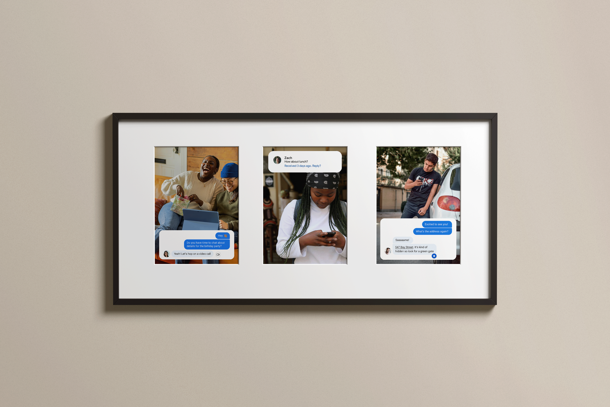
Shortcuts
A smart, contextual badge that connects users to the right action at the right moment—without leaving the conversation.
Shortcuts appear alongside relevant messages, replacing ephemeral suggestions with persistent, purposeful entry points. They help users discover useful features like saving key info, adding calendar events, or making quick calls—based on message content.
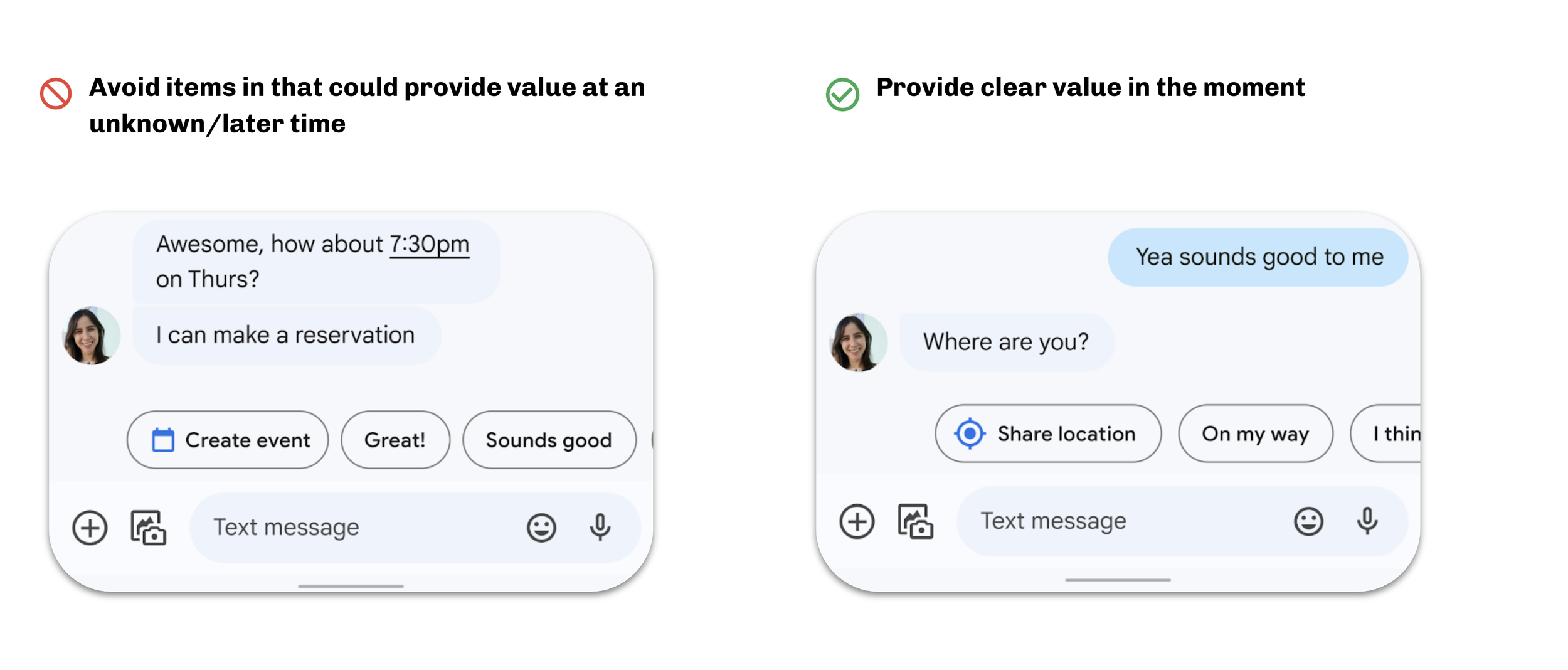
By surfacing actions only when they provide clear value, Shortcuts reduce friction and open up new use cases. In research, users described them as helpful, time-saving tools that streamline interactions and minimize context-switching.
UX States

Guidelines


Example use cases

Spotlights
Google at your fingertips—without leaving the chat.
Spotlights are subtle underlines on terms like names, dates, and addresses. Tapping one reveals a lightweight, in-app popover with helpful details or deep links into Google tools. It’s a seamless way to surface relevant info right when it’s needed—so users can stay focused on the conversation, not jump between apps.

UX States

Guidelines

Example use cases


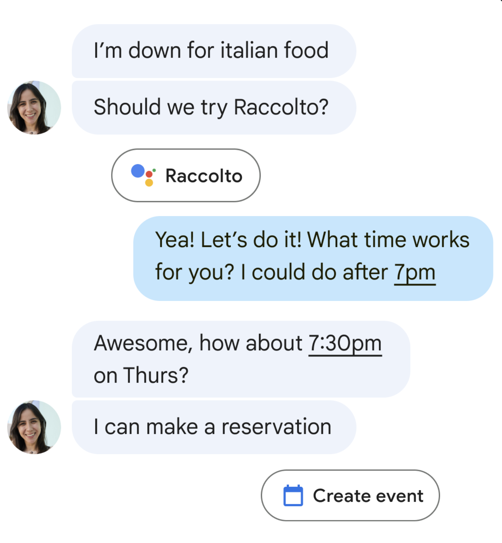
Suggestion Row
Timely prompts that keep the conversation flowing.
The Suggestion Row appears just above the keyboard, offering ephemeral, context-aware text suggestions. These suggestions are designed to help users compose replies faster, move the conversation forward, or act on time-sensitive moments—then disappear when they’re no longer relevant.
UX States

Guidelines

Example use cases
Nudges
Thoughtful reminders to follow up—so nothing gets missed.
Nudges surface important messages to the top of the conversation list, helping users remember to reply, say happy birthday, or check in on an order. By identifying time-sensitive or question-based messages, Nudges address one of the top user needs: not forgetting to respond. They’re subtle, timely, and designed to support meaningful conversations without interruption.

UX States

Guidelines

Example use cases
Outcome
All patterns launched and most are still live today. Shortcuts drove a notable increase in action usage, validating the value of timely, contextual entry points. Spotlights, our boldest pattern, was sunset after a reorg—but its core ideas now influence assistive design across Gemini experiences.
Our smart features guidebook is still used across teams, helping shape how assistive patterns are designed with user trust and clarity in mind.
Reflections
This was one of the most challenging and rewarding projects I’ve worked on. It pushed me to think deeply about what useful assistance looks like, and how to design for intent without being intrusive.
It also reminded me how powerful cross-functional collaboration can be at Google. We built strong alignment across product, engineering, and research, grounded every decision in user needs, and crafted a set of principles that carried us through shifting priorities. While not every pattern landed the way we hoped, the work laid meaningful groundwork—for future assistive design and for my own growth as a designer.